I have a database that keeps stats of mail messages that arrive for me. The database has a record summarizing data about each message. The database is updated each night at midnight with the preceding day's data. The data goes back to September 8, 2008. There are records for 6,391 days worth of data (a few days are missing) using up 279.7 MB of storage. It has records for 2,656,569 messages received since then. Of that total 2,169,966 (81%) were immediately classified as almost certainly Spam and not even looked at. So on the average over that time I got 415 messages per day and classified 339 as Spam. The total size of all messages over this period was 33.0 GB (5.3 MB per day) of which 25.6 GB was Spam (77% of all bytes).
The day with the highest total message count was Wednesday, June 9, 2010 with 3,905 messages of which 3,794 (97%) were Spam. That was also (not surprisingly) the day with the most Spam messages. The day with the highest Spam fraction was Sunday, July 26, 2015 with 1 messages of which 1 (100%) were Spam.
I used to have low count days here as well, but they turn out to be days when the mail server was down most of the day. So, the low counts weren't because I wasn't being sent much, but because it couldn't be delivered.
In the last week I have received 925 messages. Of which 511 (55%) were Spam. So on average over the week I got 132 messages per day and classified 73 as Spam.
Here are some plots over time. In each of these plots the data is averaged for each month. There is a vertical bar for each calendar month, the year labels on the X axis mark January of each year.
As someone who has been around the net for a long time (over 50 years) I'm on every Spammer's list. I have set up some very strict filters for incoming messages. These first charts look at how much of my arriving mail gets preclassified as Spam.
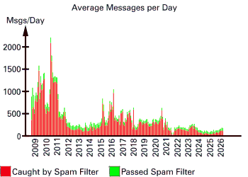
In this first graph, for each month I have data, I plot the average number of messages per day showing the Spam/not Spam distinction. The total height of the bar is average number of messages per day, the red part was Spam and the green was (maybe) not. Historically Spam has really swamped the good stuff at times. Also, while it looks like there was more good stuff at the beginning, that's only because I'm plotting what the incoming filters decided. They just weren't as good at identifying Spam for the first few months of this data. More explanation with the later graphs.
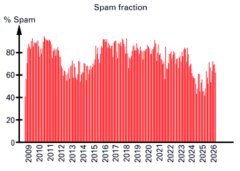
This shows how the fraction that's classified as Spam has varied over time. Notice that right at the beginning there's a bit of steep rise. It was rising Spam rates that made me want to track this data. It's a pity I don't have data going back further to show how it was before that. The reason the fraction classified as Spam went up sharply was that I was adjusting the Spam filters to get better.
OK, enough for getting swamped with Spam. Here are plots of just the potentially useful messages I got...only "potentially" because some Spam still gets through the filters, and I don't record whether I'm deleting a message because I've read it and don't need it or because it was Spam that got through. The database records the delivery and not what I do with it.
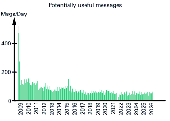
First a plot of how many messages didn't get pulled as Spam. In this graph you'll notice a high peak at the start and then a precipitous drop. This was because I noticed that unfiltered Spam was rising greatly and realized I wanted to track it over time and started this database. So, the data starts around the time I started to deal with it (when it was at its worst). But, then I worked on the Spam filters and improved things quite a bit after which it settled down a bit.
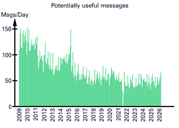
If I leave off 2008, which is relatively easy, you can see the extra detail. Note: this also makes both scales change, so account for that when comparing the graphs.
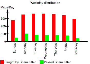
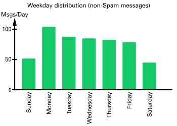
In these graphs we plot incoming messages based on what day of the week they arrive. The first plot has both Spam and non-Spam messages, the second shows just the non-Spam messages, so the vertical gets rescaled. There does seem to be less (both Spam and non-Spam) mail on weekends.
And, if you want the actual numbers behind the second graph, here they are in a table:
|
Web site designed, developed and hosted by
MAP Network Engineering
MAP Network Engineering uses,
supports and recommends
Open Source software
and open standards.
![]()
![]()
![[Open Source Iniative]](http://www.opensource.org/trademarks/opensource/web/opensource-75x65.png "[Open Source Iniative]")
![[Self professed Hacker]](/img/glider.png "[Self professed Hacker]")
![]()
![]()
Use of the logos above does not imply endorsement by the
respective organizations of MAP Network Engineering sites or
services.
On the contrary it implies endorsement by MAP Network
Engineering of those organizations or software.
Page generated 2026-03-24
at 12:41 GMT
Copyright © MMXXVI
Michael A. Patton
And finally, a random note:
If you are not part of the solution, then you are part of the precipitate.